
Intro
A photo-based social media platform focused on the natural world, Skygram disables selfie mode and encourages people to admire the world around them. Drawing inspiration from the beauty of the sky, especially sunrises and sunsets, this app was born out of desire to detach the ego from social media.
Skygram logo and app icon
Project Meta
Role
Digital Product Designer
Timeline
summer 2019, revisited December 2022
Contributors
Designer: Liz Hixon
Advisor: Micah Barta
Contribution
From journey maps and wireframes, to branding and visual design, I had a great time exploring this personal project.
Background
Loosely based on a university assignment to design an app that would get people to engage with the physical world, I later decided to expand upon the initial brief to create a full scale social media application.
Skygram was largely inspired by a good friend struggling with severe depression. We had a code phrase, “moon check,” we’d say to each other if the sky was especially beautiful, encouraging the other to go outside and appreciate it. This was one of the few things that motivated her and brought her joy. Skygram is kind of like the automated version of that interaction.
Process
Initial Research
I kicked off the design process with an audit of mobile apps and social media platforms with similar features.
Some elements that stood out to emulate:
minimal use of color, allowing posted photos to shine
sticky bars that provide easy navigation
maximizing screen space to display user content
Planning
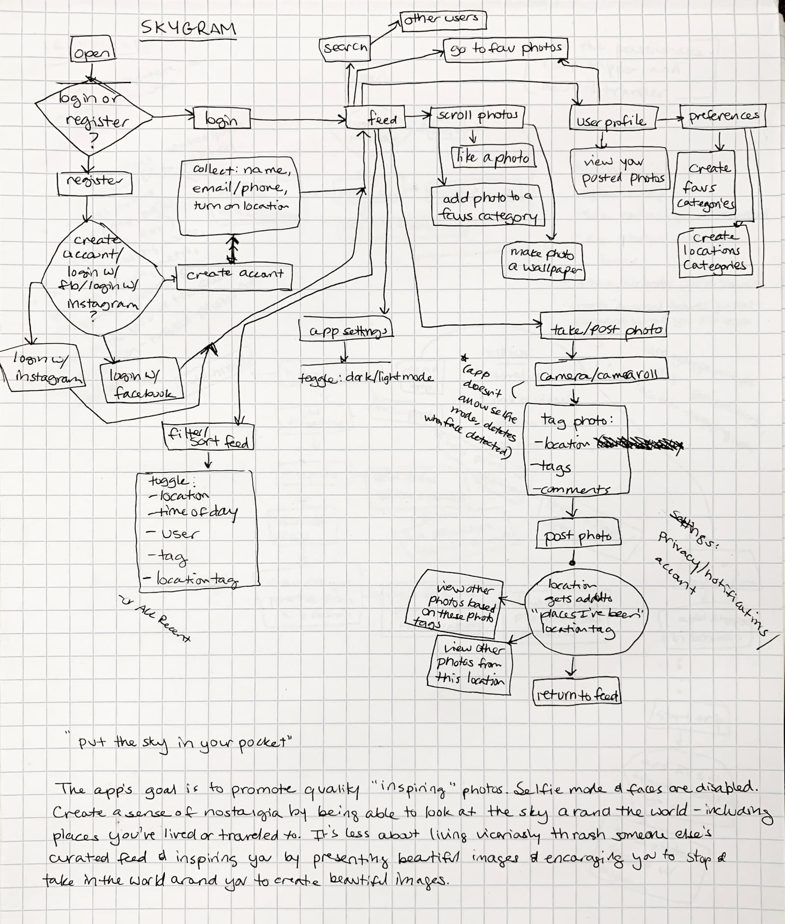
The next step involved extensive planning, beginning with journey maps to outline important features and how people would navigate the app.
Armed with these flowcharts and my research, I began sketching wireframes by hand. I drew numerous variations to determine the most effective mechanism for presenting a simple yet robust interface.
Wanting an easily navigable design, I ensured that key features were within thumb’s reach. The floating camera and menu icons allow people to easily post new photos and access important application settings.

User flow explorations


Menu and layout explorations
Design Iterations
I transferred the most effective wireframes into the computer to create high fidelity iterations.
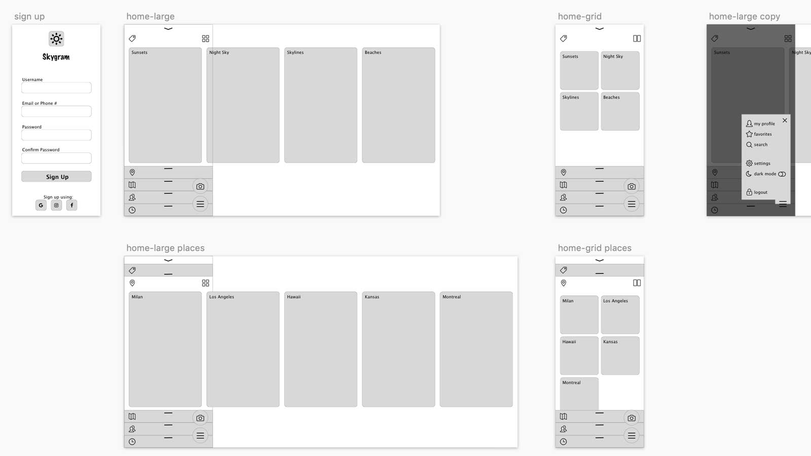
High fidelity wireframes outlining position of elements on the screen
For the visual interface, I wanted to minimize the brand presence so photos were the ultimate star of the show while still presenting a clear brand throughout the app. I drew inspiration from sunsets to create a cohesive color palette across the application.
For accessibility and flexibility, I wanted to provide options for both dark and light modes. To accomplish this, I slightly modified the palette for sufficient contrast in each color mode. When applied to the interface, the result is a distinct brand that complements the photos without distracting from them.
Color variations for light and dark modes
Interactive Prototyping
The interactive prototype allows you to imagine how the app could function. Access the prototype for yourself by clicking here. (Though keep in mind that transitions and animations in Figma are not ideal!)
Periodic Feedback
Every couple weeks, I met with a design mentor who reviewed and critiqued progress made on the application. He made recommendations and proposed challenges to improve the usability and visual design of the app.
Component Library
I built out a component library with components that can be reused across the app. The library includes logos, colors, icons, buttons and larger components. Using variables and properties, it’s quite easy to toggle dark and light modes and make small modifications to each component as needed.

Components in the design system including logos, colors, icons and components
Outcomes
Overview
Skygram provides the ability to curate content from around the globe by saving tags and following others. In addition to the standard timeline, the feed can be customized by favorite tags (“sunrises”), specific locations (San Diego), saved places (“where I’ve lived”) and friend groups (“family members”).
A toggle on the timeline enables a circular sun slider that ignores timezones, allowing you to see the world based on the position of the sun rather than by the universal time the photo was posted.


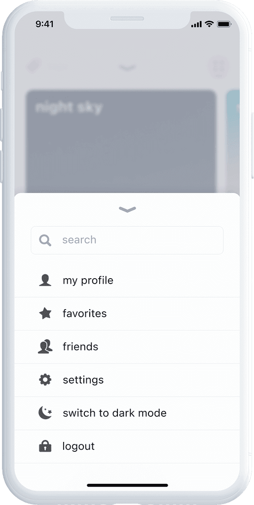
Screens featuring key application features
Feedback
Having shared about Skygram on various platforms, I received a lot of feedback from people expressing enthusiasm about it. Though I don’t plan to produce the application for use, it was exciting to hear from many people who liked the idea of the app and suggested they would like to use it.

Application screens